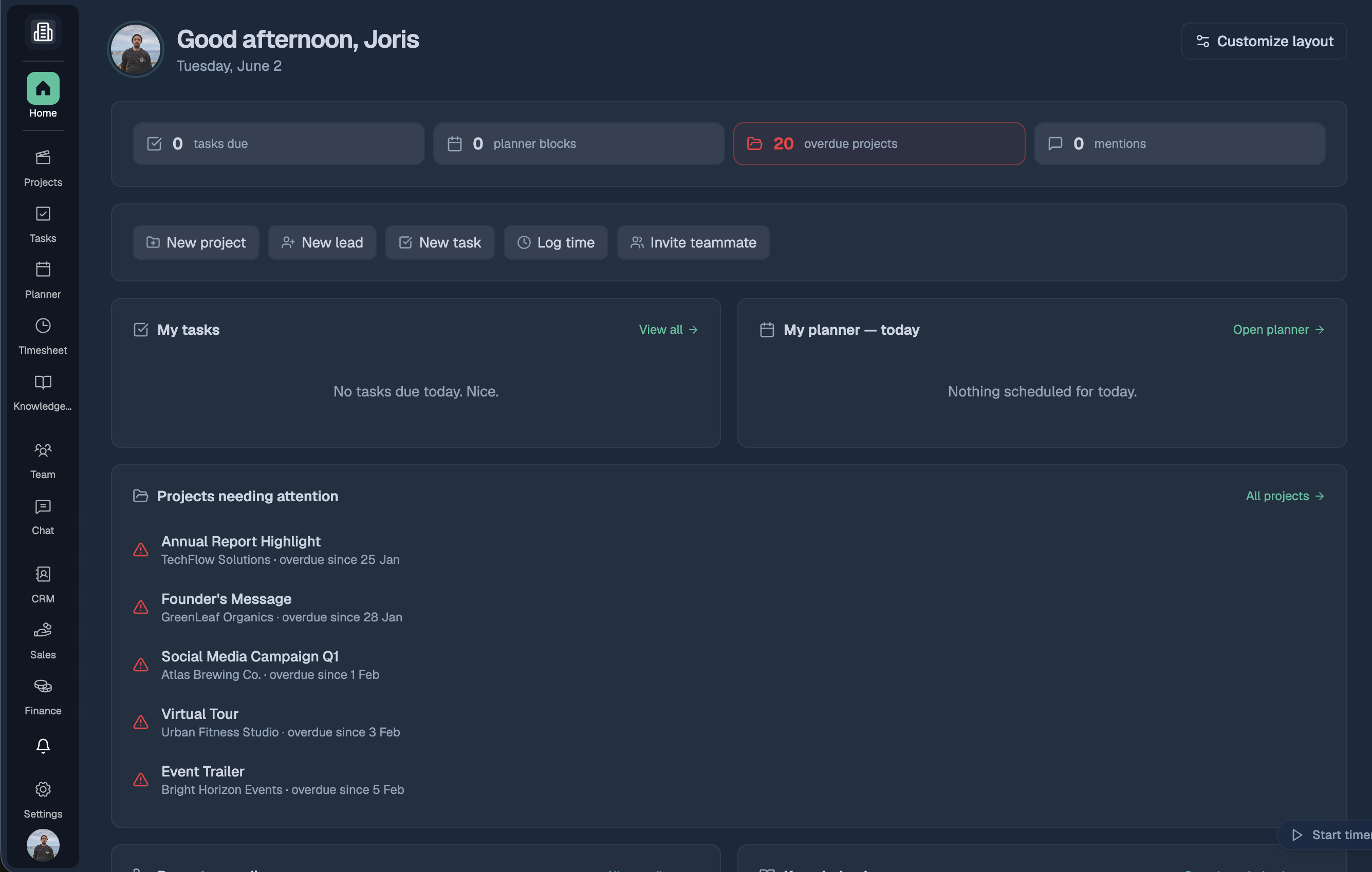
A faster, clearer way to move around the platform 🧭
We've rebuilt the main navigation from the ground up. The old single sidebar is now a slim icon rail down the left edge — every workspace is one click away, with a clear label under each icon so you always know what's what.
What's new
Grouped workspaces. Icons are organised into logical clusters so related tools sit together:
Work — Projects, Tasks, Planner, Timesheet, Knowledge Base
Team — Team & Chat
Business — CRM, Sales, Finance
Community
Everything has a home. Tasks, Planner, Timesheet and your Team page are now top-level destinations instead of being buried in submenus.
Company switcher up top. Switch between companies from the top of the rail — always in the same spot, on every page.
A cleaner two-panel layout. The rail pairs with a floating side panel that shows the right options for wherever you are. On Settings, Messages and your dashboard, the panel steps aside so your content gets the full width.
Settings is now its own page. No more modal — Settings opens as a proper page with its own navigation, so you can deep-link and bookmark any section.
Adapts to your screen. On shorter windows the rail tucks extra items into a tidy More menu instead of cutting them off.